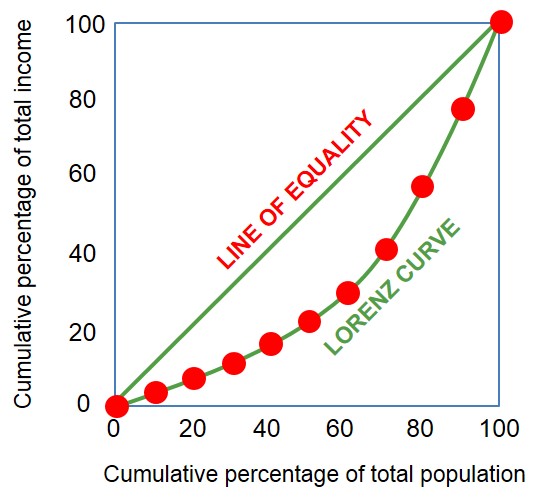
A graph which indicates the level of income inequality for a country by plotting the cumulative percentage of total national income against the cumulative percentage of the corresponding population.
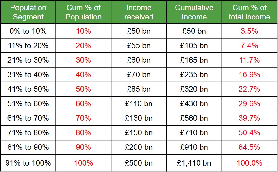
Below is a table and diagram to illustarte how the lorenz curve is formed. The Lorenz curve bends away from the x axis as generally the bigger the population segment the bigger the percent of total income belongs to them. But the closer the curve is to the line of equality (income is equally distributed amongst all income groups) the fairer the distribution of income across the country. Likewise the more bowed out the lorenz curve becomes the more unequal the distribution is as a very samll percentage of the population holds majority of the income of a country.